
Research
For research there were many things we did in order to find out what we wanted to do.
The first thing in research you need to ensure is that you have a good information supplier. Something you can use to access information quick. It could be a local library or even word of mouth. But one of the biggest forms of research today is The Internet.
Through the internet research can be found in many different ways. The primary way to search the internet is through the use of a Searh Engine.
Search Engines:
Here is the definition of a search engine (Source: Wikipedia)
A web search engine is designed to search for information on the World Wide Web and FTP servers. The search results are generally presented in a list of results and are often called hits. The information may consist of web pages, images, information and other types of files.
There are also different types of search engine.
The main one known by every person on the face of this earth is Google:
 Quick fast and efficient and offers enough relative results for up to 10 pages. This is the bes one out of all of them simply because it can find anything you want us long as you type in the keywords or phrase.
The user interface is simple and selfexplanitory. Everything you want to do can be navigated as soon as google.com is typed within the web browser
The secondary search engine used was Wikipedia. The websites engine works like an Encyclopedia where the public is able to contribute and usually is moderated by the site admins. Type in the keyword, subject or topic and your search should pop up with a detailed history of what you want.
Here is a screenshot of the user interface
 Another additional feature to the search engine is the ability to be able to change the language on the website. Not appropriate for our class seeing as everyone speaks and reads the english language to a high standard.
For researching videos Youtube was nicknamed "Video Google" because of the effiency and the speed of how quick you can find horror movie trailers and many other things. The user interface is normal and easily sussable. Navagation is very easy and things are clear to see. Here is the user interface of the Youtube Home Page.

The last form of research we used is through the LRC (Learning Resource Centre). Picking up and reading a little information on movie genre's seemed to be one of the effective ways and also fun in the process.
Types Of Research:
We also did two different kinds of experiments in order to gain information about our Horror Movie Trailer
The first one was a Survey (Results not collected due to one of the members of the group slacking):
The specific Survey we performed was a Statistical survey. A statistical survey is a type of method used to collect information in a systematic way from a certain amount of individuals.
Surveys provide information for all kinds of research fields, e.g. marketing research, mulitmedia, and health professionals . A survey typically focuses on different topics such as preferences , behavior , or factual information, depending on what it is being used for.
Since survey research is always based on a sample of the population, the success of the research is dependent the small amount of population that are concerned about the issue being surveyed.
There are also many modes of collection information.
Here are the different modes with a brief overview of what it is:
Telephone - Where the respondentsis asked question via telephone.
What we did was ask 20 questions based on what people like and disliked about horror movies is a Personal mall intercept survey. Due to the results not being tallyed up I am presuming that it is 50:50 that people like and dislike certain aspects of a horror movie.
What We Researched On.
What we researched on was about the Horror Movie Genre using Wikipedia as our primary source of information

Duration Of Research.
Not long. Research lasted up to a week due to quick and easy access of information.
Here are some of the options that were used during the process of making our film. There are also alternative options. But I found that these are the 3 most effective ways of doing research on Horror Movie Genre
Planning is an essiential part of anything we do in life. If you fail to plan, you plan to fail. So I always ensure that when im doing activities I make sure that I have a backup plan as well as a main plan.
How We Planned The Movie Teaser Trailer.
We were able to plan it effectively through a shooting script and storyboard. Also we looked at multiple locations across the school grounds and decided we will use the corridor and outside and get an establishing shot of the college.
Storyboards are graphic organizers such as a series of illustrations isplayed in sequence for the purpose of pre-visualizing a motion picture, animation, motion graphic or interactive media sequence.
We organised the storyboard in major shots. So we only drew the major shots that are going to be used and all the minor shots were improvised during filming. The way I like produce media is to draw out the main points that we will be shooting then during filming, no matter the situtation, the idea's always come to me.
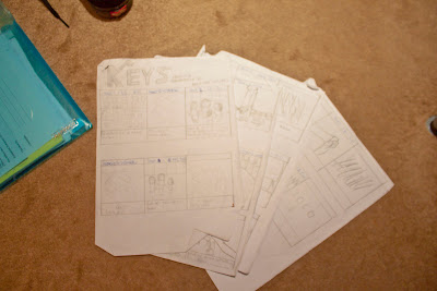 Here is a photo of the storyboard and the shots drawn. (Very rubbish art work)
The College Shot
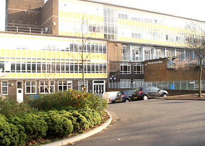 Here is the establishing shot of the college. This is the location we used. We able to get many of the shots from the trailer in whilst filming in this area. The lighting was good and natural so we did not need to use any other sources of lighting. The weather was great and bright so the colours are more flatter and colour grading becomes much easier.
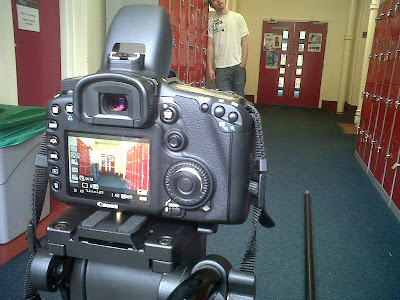
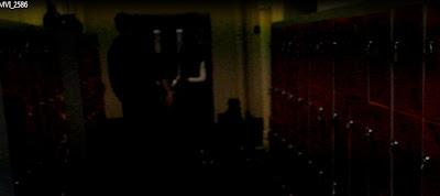
The Corridor Shot
 Here is a shot of the corridor in which we shot in. The lighting was very poor so the ISO level was chucked up to a whopping 6800. Also we had some problems with the lens flickering, but this was due to the flourescent lights that were being used in the building. We were able to conquer this by chucking up the ISO level to a higher number (3200 - 12800) and also setting the white balance to around +2. The image you see above was slightly over exposed this is because the screenshot was taken from a video. During the video the footage looked dark during recording so I raised the ISO settings a bit too high, making the white shine through more than any other colour.
Production
We managed to produce this video using equipment the college provided for us. We used a Canon EOS 7D and a Manfrotto head tripod. Manfrotto tripod's have very smooth heads and allow flowing panning and rotations.
Search Engines:
Here is the definition of a search engine (Source: Wikipedia)
A web search engine is designed to search for information on the World Wide Web and FTP servers. The search results are generally presented in a list of results and are often called hits. The information may consist of web pages, images, information and other types of files.
There are also different types of search engine.
The main one known by every person on the face of this earth is Google:
 Quick fast and efficient and offers enough relative results for up to 10 pages. This is the bes one out of all of them simply because it can find anything you want us long as you type in the keywords or phrase.
The user interface is simple and selfexplanitory. Everything you want to do can be navigated as soon as google.com is typed within the web browser
The secondary search engine used was Wikipedia. The websites engine works like an Encyclopedia where the public is able to contribute and usually is moderated by the site admins. Type in the keyword, subject or topic and your search should pop up with a detailed history of what you want.
Here is a screenshot of the user interface
 Another additional feature to the search engine is the ability to be able to change the language on the website. Not appropriate for our class seeing as everyone speaks and reads the english language to a high standard.
For researching videos Youtube was nicknamed "Video Google" because of the effiency and the speed of how quick you can find horror movie trailers and many other things. The user interface is normal and easily sussable. Navagation is very easy and things are clear to see. Here is the user interface of the Youtube Home Page.

The last form of research we used is through the LRC (Learning Resource Centre). Picking up and reading a little information on movie genre's seemed to be one of the effective ways and also fun in the process.
Types Of Research:
We also did two different kinds of experiments in order to gain information about our Horror Movie Trailer
The first one was a Survey (Results not collected due to one of the members of the group slacking):
The specific Survey we performed was a Statistical survey. A statistical survey is a type of method used to collect information in a systematic way from a certain amount of individuals.
Surveys provide information for all kinds of research fields, e.g. marketing research, mulitmedia, and health professionals . A survey typically focuses on different topics such as preferences , behavior , or factual information, depending on what it is being used for.
Since survey research is always based on a sample of the population, the success of the research is dependent the small amount of population that are concerned about the issue being surveyed.
There are also many modes of collection information.
Here are the different modes with a brief overview of what it is:
Telephone - Where the respondentsis asked question via telephone.
Mail - The questionnaire may be handed to the respondents or mailed to them, but in all cases they are returned to the researcher via mail.
Online Survey's - Can use web or email Web is preferred over e-mail because interactive HTML forms can be used
Personal in-home survey -respondents are interviewed in person, in their homes (or at the front door)
Personal mall intercept survey - shoppers at malls are intercepted - they are either interviewed on the spot, taken to a room and interviewed, or taken to a room and given a self-administered questionnaire.
What we did was ask 20 questions based on what people like and disliked about horror movies is a Personal mall intercept survey. Due to the results not being tallyed up I am presuming that it is 50:50 that people like and dislike certain aspects of a horror movie.
What We Researched On.
What we researched on was about the Horror Movie Genre using Wikipedia as our primary source of information
Duration Of Research.
Not long. Research lasted up to a week due to quick and easy access of information.
Here are some of the options that were used during the process of making our film. There are also alternative options. But I found that these are the 3 most effective ways of doing research on Horror Movie Genre
Planning is an essiential part of anything we do in life. If you fail to plan, you plan to fail. So I always ensure that when im doing activities I make sure that I have a backup plan as well as a main plan.
How We Planned The Movie Teaser Trailer.
We were able to plan it effectively through a shooting script and storyboard. Also we looked at multiple locations across the school grounds and decided we will use the corridor and outside and get an establishing shot of the college.
Storyboards are graphic organizers such as a series of illustrations isplayed in sequence for the purpose of pre-visualizing a motion picture, animation, motion graphic or interactive media sequence.
We organised the storyboard in major shots. So we only drew the major shots that are going to be used and all the minor shots were improvised during filming. The way I like produce media is to draw out the main points that we will be shooting then during filming, no matter the situtation, the idea's always come to me.
 Here is a photo of the storyboard and the shots drawn. (Very rubbish art work)
Location
The location was figured out by it correlating with the story line. If our story line was about a phycotic Janitor it would not be very smart to set the trailer in a park. A janitor who is someone who stays on a compound all the time. So we thought since were in college we might aswell use the college grounds to film the trailer.
The location was figured out by it correlating with the story line. If our story line was about a phycotic Janitor it would not be very smart to set the trailer in a park. A janitor who is someone who stays on a compound all the time. So we thought since were in college we might aswell use the college grounds to film the trailer.
The College Shot
 Here is the establishing shot of the college. This is the location we used. We able to get many of the shots from the trailer in whilst filming in this area. The lighting was good and natural so we did not need to use any other sources of lighting. The weather was great and bright so the colours are more flatter and colour grading becomes much easier.
The Corridor Shot
 Here is a shot of the corridor in which we shot in. The lighting was very poor so the ISO level was chucked up to a whopping 6800. Also we had some problems with the lens flickering, but this was due to the flourescent lights that were being used in the building. We were able to conquer this by chucking up the ISO level to a higher number (3200 - 12800) and also setting the white balance to around +2. The image you see above was slightly over exposed this is because the screenshot was taken from a video. During the video the footage looked dark during recording so I raised the ISO settings a bit too high, making the white shine through more than any other colour.
Equipment
Another part of planning was the equipment were going to use. We need a track, a tripod and a Camera.
We used a Canon EOS 7D. One of the best camera's in the DSLR range right after the 5DMarkII.
This camera allows manual focus ring feature, and internally it has 18 focus spots rather than the usual 9 on some DSLR's.
We used a Canon EOS 7D. One of the best camera's in the DSLR range right after the 5DMarkII.
This camera allows manual focus ring feature, and internally it has 18 focus spots rather than the usual 9 on some DSLR's.
Overall I think the preparation of the project was ok. The time managment skills were not fine tuned but that is due to lack of attendance from other member's of the group disabling us from filming. Other than that, it went well.
Setup Time
Setting up for filming usually took up a bit of time. To ask our teacher for the equipment usually took around 10 minutes. Because sometimes we did not know if the camera's had been booked for that lesson.
To ensure this we used a booking form every time we wanted to film and booked advance dates to ensure that no one else would take our equipment for film.
Familiarisations
For Me (Harold), I found getting to grips with the camera very easy. I previously owned a 7D for a short while. Borrowed to me by my cousin. I knew how to adjust most of the settings properly for shooting. I knew about shooting modes, picture styles, Exposure and White balancing. This made shooting very fun, because then I got to use tracks and lights, making it a good experience shooting with stuff I had not shot with before
We managed to produce this video using equipment the college provided for us. We used a Canon EOS 7D and a Manfrotto head tripod. Manfrotto tripod's have very smooth heads and allow flowing panning and rotations.
We completed all of our footage over the period of a month. To make our work look realistic, we used a variety of props like; plastic knives, masking tape, fake blood, keys etc. All these played important roles. We had 3 main locations in which we shot our footage. During our filming we relied a great deal on a track for our camera, to help our shots have smooth zooms/tracking,


this effect we hoped would build tension in the trailer.
The person filming had to be very aware and steady with the camera so it didn't loose focus, this we were warned would loose us marks.
Through doing my own projects with the 7D I realised that precise focusing is what is needed to get a clear and sharp shot.
On the 50mm lens has a strong depth of field can change the focus of the shot. The 50mm is a prime lens, meaning it doesn't zoom. Also it has a low F Stop (aperture) setting of 1.8 meaning it can let in alot of light in darker settings.
I think the 50mm lens is very effective at getting those 'Blurrier Background' shots. The only problem with is that it shakes very easily, so if the lens is not put on a tripod or a monopod it will be very unsturdy and alot of rolling shutter can happen.
Lighting
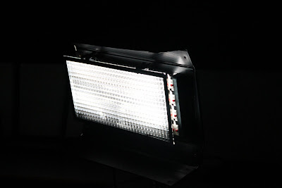
We used natural lighting for most of the shots, expect for the torture scene. Where we used the white light to give our victim character the spotlight:
Here is an image of the white light we used to achieve the spotlight.
We also had to lower the aperture setting, and bring down the ISO to about 200 so that there is no noise in the image.
We relied heavily on the editing to achieve great colouring and grading.
White Balancing
We never allowed the white balance to come of the Zero mark. Because the camera's have good Apeture and ISO Balance settings we did not need to adjust the ISO too much.
ISO
This had to be adjusted a few times. In the corridor shots when using the 18 - 135mm we had to take the ISO up to 1800 or sometimes even 3200 because it was giving off a flicker effect because of the flourecent lights in that part of the building.
When using the 50mm We never had to raise it above 800. The 50mm was perfect for that scene because of the dodgy lighting, The lens captures as much light as possible.
Photography
To take our photo's we Used a Canon EOS 400D Digital with no lights, again we used Natural lighting for the magazine shot here is the orginal photo we took for the magazine shot.

The f stop was f/16
The exposure time was 1/15th of a second
and the ISO Speed was 400
The focal length of the shot was 34 millimetres.
No flash
And No Artificial Lighting was used for this shot.
During post production the curves were set for this photo giving it a crushed effect.
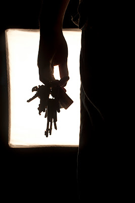
For the Poster shot we used a Canon EOS 500D. We set the file quality toRAW + JPEG. To get the maxium resolution possible.
We used the light box as back lighting to achieve the silhouette shot. We wanted it to look like the person holding the keys was coming out of a door
Here is the original photo we used for the final poster:

The F Stop was 7.1
The Exposure Time was 1/20th of a second
The ISO was really low at 100
The Focal length of the lens was at 18 millimetres. (It was a stock lens the 18 - 55mm one. So we didn't zoom in the lens).
The subject distance was 440 millimetres.
The White Balance was on AUTO
There was no flash used for the shot, as it would have shown light within the back of the subject, which will not give us the silhouette shot.
Editing
I have alot of experience in Editing , from using Linear Editing programs to using industry standard ones.
For this particular project I used Final Cut Pro for the editing and chopping of this trailer and for the images I used Photoshop CS5.
Final cut pro is very similar to my usual editor which is Adobe Premiere Pro. Performing cuts was easy with the slicing tool and putting together the clips was very easy. The only thing that was a bit of a problem was the quick render tool. Compared to Adobe Premiere, the quick render is to slap the Enter button, whereas with Final Cut you have to go up to the sequence option and click on render all.
I think this made the editing time twice as long as it should have.
For the colour grading I used Adobe Premeire CS5 and a plugin called Magic Bullet Colorista which I bought a while ago from the website. This is one of the tools used within the industry to give films that professional look.
And for the transition effects I used After Effects and a plug-in called Twitch. The transition name is called Colour Tearing'. Adobe Production Premium is a great tool for editing as it is fast and efficient. There is a useful tool on the programs called Dynamic Link this tool allows editors to link quickly between After Effects and Premiere, and make edits on After Effects that make instant changes when the project files are in Adobe Premiere. This makes work flow a lot faster and quicker.
Rendering & Exporting
On the Mac PC's at college Rendering and Exporting was not a problem as it was fast and quick due to the Hardware.
Where as at home I was using High CPU softwares and plugins, this made the computer run a bit slower than usual and also when exporting my projects I had to leave the whole computer alone so it can do it quicker. Whereas on the Macs I could still work on other stuff whilst my clips were rendering and exporting.
To be able to colour grade the work I exported the file from Final Cut Pro in an AVI format, lossless quality. This is good because it leaves the file as raw as possible not changing the quality hardly. The only problem with that is that the file size comes out big as it is uncompressed. But this problem was easily solved by taking my External Hardrive into college and transferring the file on to it.
Distribution
Distribution of the product was easily. It was uploaded to a account on You-tube and Shared across Facebook and Twitter where the user could view and comment on the product.
We posted the link on our friends walls so they could see the video the next time they logged on to Facebook


