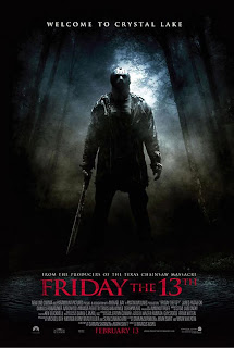
Friday the 13th, directed by Marcus Nispel, is one of many horror movies among the American Slasher Genre which was released on Friday the 13th of February, 2009. The film is a reboot of the Friday the 13th film series which began in 1980.
The main purpose for a film poster is for advertisement and to make people aware of the film. Poster distributors tend to distribute the poster to a wide audience advertising it wherever they feel necessary, such as in magazine, on billboards, on the sides of buses, the internet and many more places where they feel it can catch people’s eye. The intentions of film posters are to make people want to go and see the film or to raise awareness with intentions of selling more copies.
The main colour scheme of this poster consists of predominantly low key lighting, as does the trailer along with some red and white text. Jason’s surroundings are also very dark connoting he has something mysterious about him. The low key lighting of the poster also creates a sense of loneliness, fear and anxiety which all fit in with the genre of the film. The only high key lighting seen in the poster is the lighting coming from above the trees. It seems as if the trees are towering over Jason, blocking out the light connoting that all ‘goodness’ exists outside of the woodland. Behind Jason is a mixture of grey and blue creating a misty/Smokey effect. This is used to make Jason stand out and to add a sense of mystery to the poster. There are many things we could link to the colours on the poster, such as red connoting bloodshed and black connoting something mysterious, decay or possibly death and I believe the colour scheme was used in addition with the mis-en-scene to create a unwelcoming feeling. I believe there is a strong amount of non-verbal communication as Jason is looking directly at the camera holding a machete. I believe this suggests that he is a murderous psychopath who prefers to use a machete as his choice of weapon. The setting is deserted woodland which denotes dirt and messiness. This is backed up by Jason’s choice of clothing. Although it is not clear what Jason is wearing, we are able to see that it seems quite scruffy and dirty. The mask he is wearing also seems dirty and also connotes there is something mysterious about the film. It is also fair to say the mask denotes that Jason is a mysterious individual, who does not want anyone to see his face. This attracts audience members as they are likely to want to know what he is hiding? The machete he is holding suggest he uses machetes to attack his victims which we later find out to be true after watching the film. The machete connotes a lot of things which could fit in with the film genre, such as killings, murder and torture. Jason’s stance and props denote he is an evil person who likes to perform torture acts on his victims which helps the audience to predict he is a sadist.
A low angled shot is used to suggest that Jason is a superior individual with a fair amount of power, as it seems he is towering over the viewer connoting he is more powerful than everybody else. It almost seems like the photo is a point of view shot of one of Jason’s victims as they are lying on the floor. The long shot consists of Jason’s whole body, which makes it clear he is a tall, big built person which could suggest he uses his size to his advantage when needing to fight with his victims.
The tag line which appears above Jason’s head reads “Welcome To Crystal Lake” is in normal sans serif font and is bold so it stands out to the viewer. The tag line creates a sense of welcoming and calmness which contradicts the photo of Jason holding a machete. The tagline also creates a sense of sarcasm as it is quite clear neither that Jason, nor the area is welcoming. Although average woodland is seen as welcoming to an average person, Jason’s presence and the misty for lingering around him tells us otherwise.
The mast head on the poster is very significant as it states the name of the movie, and typically its release date. Apart from ‘Jason’ the masthead is probably the most ‘eye-catching’ part of the poster, as it is coloured in ‘blood red’ and is in large bold sans serif font. We are already aware that the decision of using the colour red has intentions of connoting bloodshed. As the posters main colour scheme is black and other low key colours, the redness of the title allows it to stand out. Above this is a selling line making the audience aware that the film is produced by the same producers of the reboot of ‘The Texas Chainsaw Massacre’ released in 2003. I believe this is to attract more fans, possibly fans of the ‘The Texas Chainsaw Massacre’ or anyone who is interested in producers producing more than one film.

No comments:
Post a Comment